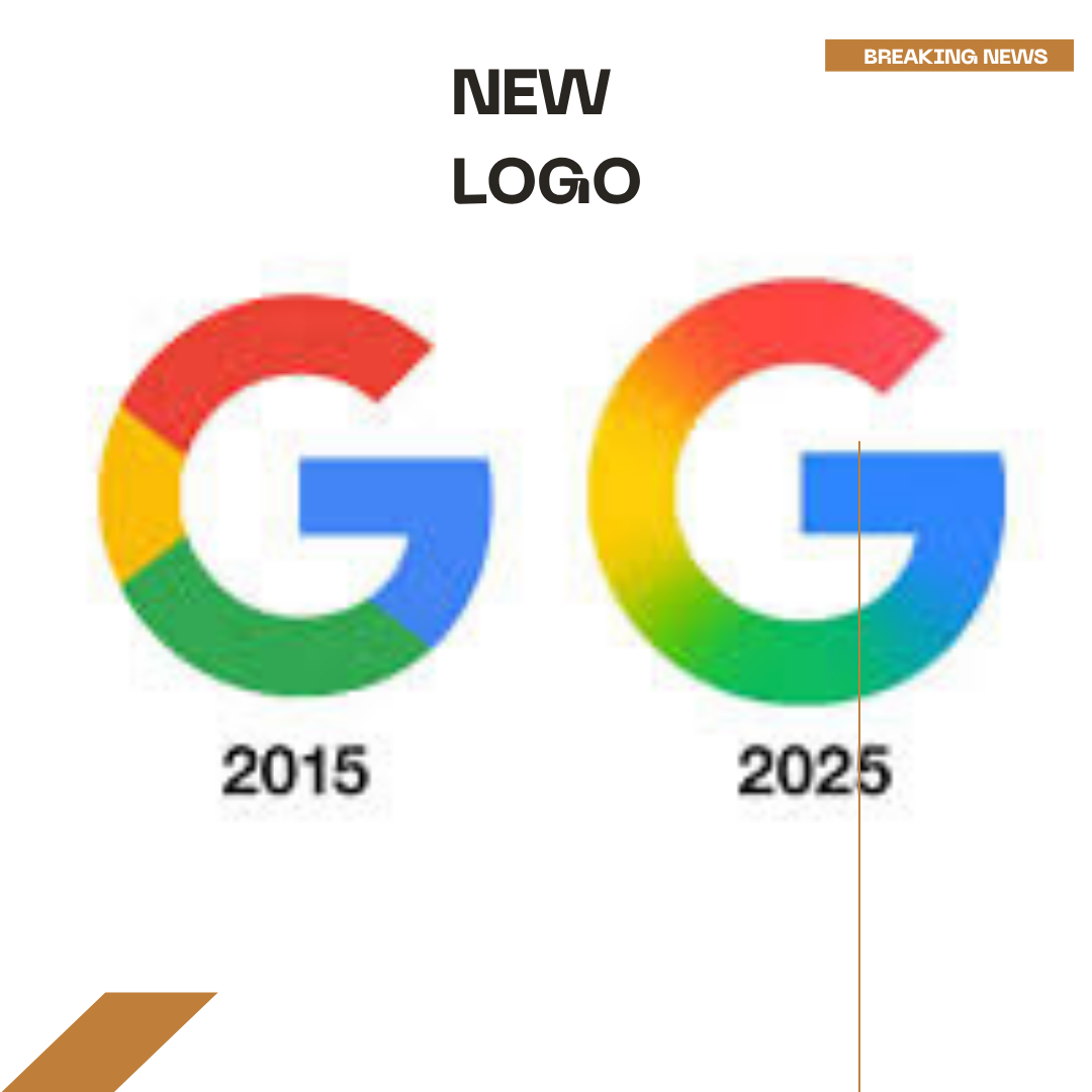
Google’s first logo redesign since 2015. This new look is similar to the recent branding of Google’s AI products including Gemini. Although the change isn’t visible when you look at the logo from far away, the new logo embraces a multicolored smooth gradient which makes it look nicer. The new gradient design is pushing the company’s modern visual identity across all its services. The new redesigned logo is already appearing on the pixel phones and Google app for IOS devices. However, the old G symbol is appearing on the web platforms and Android devices. This is not an immediate switch but a phased rollout.


